One-size-fit-all web design: Screen-size agnostic development environment.


screen-scaler.mp4

Screen-Scaler is a niche tool designed for very specific use cases. It enables you to design your application as though every user has the same screen size, automating the adjustment process for different screen dimensions by scaling your app to fit. While this can significantly streamline development for certain projects, it is not a replacement for responsive design and is not recommended for general-purpose applications.
Responsive design remains the gold standard for creating web applications that offer the best user experience across a wide range of devices. Screen-Scaler should be considered either a temporary hack or a solution for projects where user screens are highly uniform and predictable.
- 📏 Automatically scales your app to fit any screen size that differs from your target resolution.
- 🎭 Fully spoofs DOM APIs to emulate your specified settings.
- 🔌 Requires no changes to your existing code base; it's a simple function call and integrates seamlessly with any CSS Framework and UI library.
- 🛠️ Offers flexibility by enabling scaling only for specific screen size ranges. For instance, if your app renders well on large screens but breaks on smaller ones, you can activate scaling only for screen widths below
1000px. - ♿ Preserves accessibility features, allowing users to zoom in and out with
ctrl + mouse wheelor⌘ + '+/-', provided you enable this functionality (and you should).
npm install --save screen-scaler evtMake it so that your app is always rendered as if the user had a screen resolution width of 1920.
Screen scaler must run before any other UI related code runs, you should first enable screen-scaler then load your app asynchronously.
src/main.tsx
import { enableScreenScaler } from "screen-scaler";

enableScreenScaler({
    // The zoom factor is for supporting when the user zooms in or out (ctrl + mouse wheel or ⌘ + '+' or ⌘ + '-') ...
    // You can prevent the users from being able to zoom with `()=> 1920`
    getTargetWindowInnerWidth: ({ zoomFactor }) => 1920 * zoomFactor,

    // This is the id of the root div of your app. With modern frameworks, it's "root" by default in Vite projects.
    rootDivId: "root"
});

import("./main.lazy");
src/main.lazy.tsx
import { StrictMode } from "react";
import { createRoot } from "react-dom/client";

createRoot(document.getElementById("root")!).render(
    <StrictMode>
        <App />
    </StrictMode>
);git clone https://github.com/garronej/screen-scaler
cd screen-scaler
yarn
yarn start-test-appScreen scaler is setup in the src/index.tsx file.
SSR isn't supported, if in Next.js you will have to wrap your all app in a no-ssr component.
The use of vh and vw CSS properties is not supported, they can't be spoofed.
If you where using 100vh to make your app take the full height of the screen, you can use the following workaround:
 root.render(
   <React.StrictMode>
     <div style={{
        overflow: "hidden",
-       height: "100vh"
+       height: "100%", // Or height: window.innerHeight
     }}>
     </div>
   </React.StrictMode>
);When your app is rendered in a device in portrait mode, if you haven't accommodated for this your app will appear very tiny at the top of the screen and most of the screen will be unused.
In this case, you have two options:
1: Implement a portrait mode version of your app. 2: Tell your user to rotate their device:
src/main.tsx
import { enableScreenScaler } from "screen-scaler";

enableScreenScaler({
    // The zoom factor is for supporting when the user zooms in or out (ctrl + mouse wheel or ⌘ + '+' or ⌘ + '-') ...
    getTargetWindowInnerWidth: ({ zoomFactor }) => 1920 * zoomFactor,

    // If you don't want to enables your user to zoom you can provide an absolute value
    //targetWindowInnerWidth: 1920

    // This is the id of the root div of your app. With modern frameworks it's usually "root" or "app".
    rootDivId: "app"
});

import("./main.lazy");
src/main.lazy.tsx
import { evtIsScreenScalerOutOfBound } from "screen-scaler";
import { useRerenderOnStateChange } from "evt/hooks/useRerenderOnStateChange";

export function App() {
    useRerenderOnStateChange(evtIsScreenScalerOutOfBound);

    const isScreenScalerEnabled = evtIsScreenScalerOutOfBound.state !== undefined;
    const isScreenScalerOutOfBound = evtIsScreenScalerOutOfBound.state;

    if (isScreenScalerEnabled && isScreenScalerOutOfBound) {
        return <h1>Please Rotate your phone, this app does not render well in portrait mode.</h1>;
    }

    return <>{/* ... Your App ... */}</>;
}The issue with scaling down your app is that the text becomes increasingly smaller as the screen size decreases. Conversely, on very large screens, everything appears disproportionately large, creating the impression that the app is designed for children. These issues can be mitigated by dynamically adjusting the target width.
enableScreenScaler({
    // Example: Disabling the scaling for screen width above 1100px
    targetWindowInnerWidth: ({ actualWindowInnerWidth }) => Math.max(windowInnerWidth, 1100)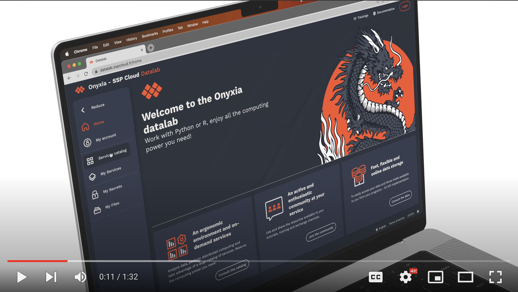
});This library has been used to build the following projects:
git clone https://github.com/garronej/screen-scaler
cd screen-scaler
yarn

# Start the test app in watch mode
yarn start-test-app

# Link in an external project in watch mode
yarn link-in-app YOUR-APP # ../YOUR-APP is supposed to exist